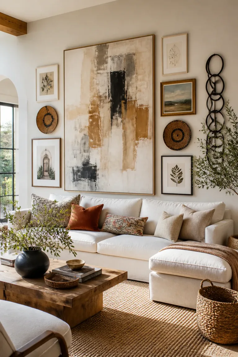
16 Stunning Living Room Gallery Wall Ideas
A living room gallery wall can bring personality to a blank stretch of wall, tie together colors already in your space, or turn favorite objects into part of the decor. The best arrangement depends on more than the artwork: furniture, wall shape, frame finishes, and how much visual detail you enjoy all play a part.
These gallery wall ideas for living room spaces range from neat, symmetrical layouts to layered collections with textiles, mirrors, and family keepsakes. Each one includes practical pointers to help you plan the arrangement and make it feel connected to the rest of the room.
Whether you’re decorating above a sofa, working around a television, or making an awkward corner feel intentional, start with a layout that suits the wall and the way you use the room. You can adapt the examples to your own art, frame collection, and style rather than trying to match them exactly.
Quick Answer
The easiest living room gallery wall is a classic grid of matching frames or a compact gallery centered above the sofa. For a relaxed, collected look, build an asymmetrical cluster, layer art on picture ledges or mix in mirrors, textiles and shadow boxes; for a bold statement, run a floor-to-ceiling column, wrap the gallery around a corner or frame it with wall sconces.
1. Arrange a Classic Grid of Matching Frames
Best for: Clean, modern living rooms
Effort: An afternoon project
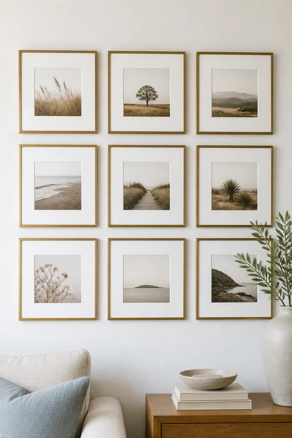
A classic grid gives a living room wall a calm, orderly focal point. Use frames of the same size and finish, then arrange them in straight rows and columns to create a clean square or rectangle. This layout suits modern, transitional, and minimalist rooms, especially when nearby furniture has simple lines.
Uniform spacing matters more than filling every inch. A consistent gap helps the arrangement read as one composed display instead of a collection of separate pieces. The artwork can match, too, but a set of different photos or prints feels cohesive when the frames and mats repeat.
How to plan the grid
Lay the frames out on the floor first and measure the overall width and height. A paper template on the wall can help you check placement above a sofa or console before you make holes.
- Choose frames with identical outer dimensions for a crisp grid.
- Repeat one frame color and mat style throughout the arrangement.
- Keep the gaps between frames even in both directions.
- Use a shared theme, such as portraits, landscapes, or abstract prints.
The result brings structure to the wall while letting the artwork add personal character.
2. Build a Balanced Asymmetrical Art Cluster

Best for: A relaxed, collected look
Effort: An afternoon project
An asymmetrical gallery wall feels relaxed without looking accidental. Start with one larger piece as the visual anchor, then let smaller frames extend around it in an organic shape. This approach works well when you have art in several sizes or want a collected look that feels less formal than a grid.
Balance comes from visual weight, not matching every frame. A dark print on one side might be balanced by a group of lighter, smaller pieces on the other. Keep the full arrangement in mind so the outer edges feel intentional, particularly when the cluster sits above a sofa or sideboard.
How to keep it balanced
Arrange the anchor first, then build outward while checking the composition from across the room. Try paper templates to test the silhouette before hanging anything.
- Place the largest artwork near the center of the grouping.
- Distribute dark colors and bold images across the arrangement.
- Vary frame sizes, but repeat a finish or color for cohesion.
- Keep the outer edges visually contained rather than scattered.
A little variation makes the wall feel personal, while a considered outline keeps it polished.
3. Stack Frames in a Floor-to-Ceiling Column
Best for: Narrow walls and tall ceilings
Effort: An afternoon project
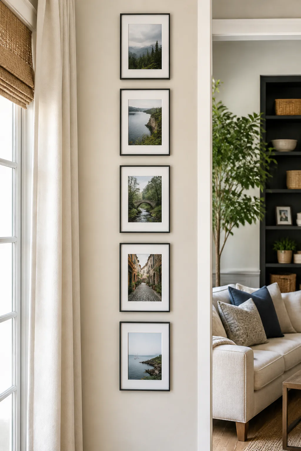
A narrow vertical column of frames draws the eye upward and can emphasize the height of a living room. It is a useful option for a slim stretch of wall, such as the space beside a doorway, a window, or a tall bookcase. Repeating frame shapes helps the column feel deliberate rather than like leftover art placed in a line.
The arrangement can be made from matching frames for a clean effect or from varied sizes for a more collected look. Either way, keep the pieces close enough to read as one vertical composition. Avoid letting the column compete with a nearby gallery or large piece of furniture.
How to build a vertical line
Mark a central vertical guide with removable tape, then place each frame in relation to that line. Check the top and bottom edges against nearby architectural details so the display feels connected to the room.
- Choose a narrow wall section with clear space around it.
- Align frame centers or edges along one consistent vertical line.
- Repeat a frame style to make varied artwork feel unified.
- Leave enough room at the top and bottom to avoid a cramped look.
This simple format adds height without needing a wide wall.
4. Center a Compact Gallery Above the Sofa

Best for: First-time gallery walls
Effort: Under two hours
A compact group of four to six frames can create a focused feature above the couch without overwhelming the seating area. Center the arrangement over the sofa rather than over the entire wall, especially if the couch sits off-center. This gives the living room a clear visual anchor and helps the artwork relate to the furniture beneath it.
Keep the gallery’s overall width in proportion to the sofa, and leave comfortable breathing room above the back cushions. A small, deliberate cluster often looks more balanced than a display that stretches too far toward the ends of the wall. Matching frames or a shared palette can make the group feel cohesive.
How to position the grouping
Mock up the layout with paper shapes and view it from the main seating position. Adjust the height and spacing until the art feels connected to the sofa rather than floating high on the wall.
- Center the cluster on the sofa’s midpoint.
- Keep the arrangement’s width in proportion to the couch.
- Use four to six pieces for a compact, easy-to-read feature.
- Repeat colors from cushions, throws, or nearby decor.
The result feels intentional while leaving the rest of the wall visually open.
5. Layer Art on Floating Picture Ledges
Best for: Renters and people who like to rearrange
Effort: An installation project
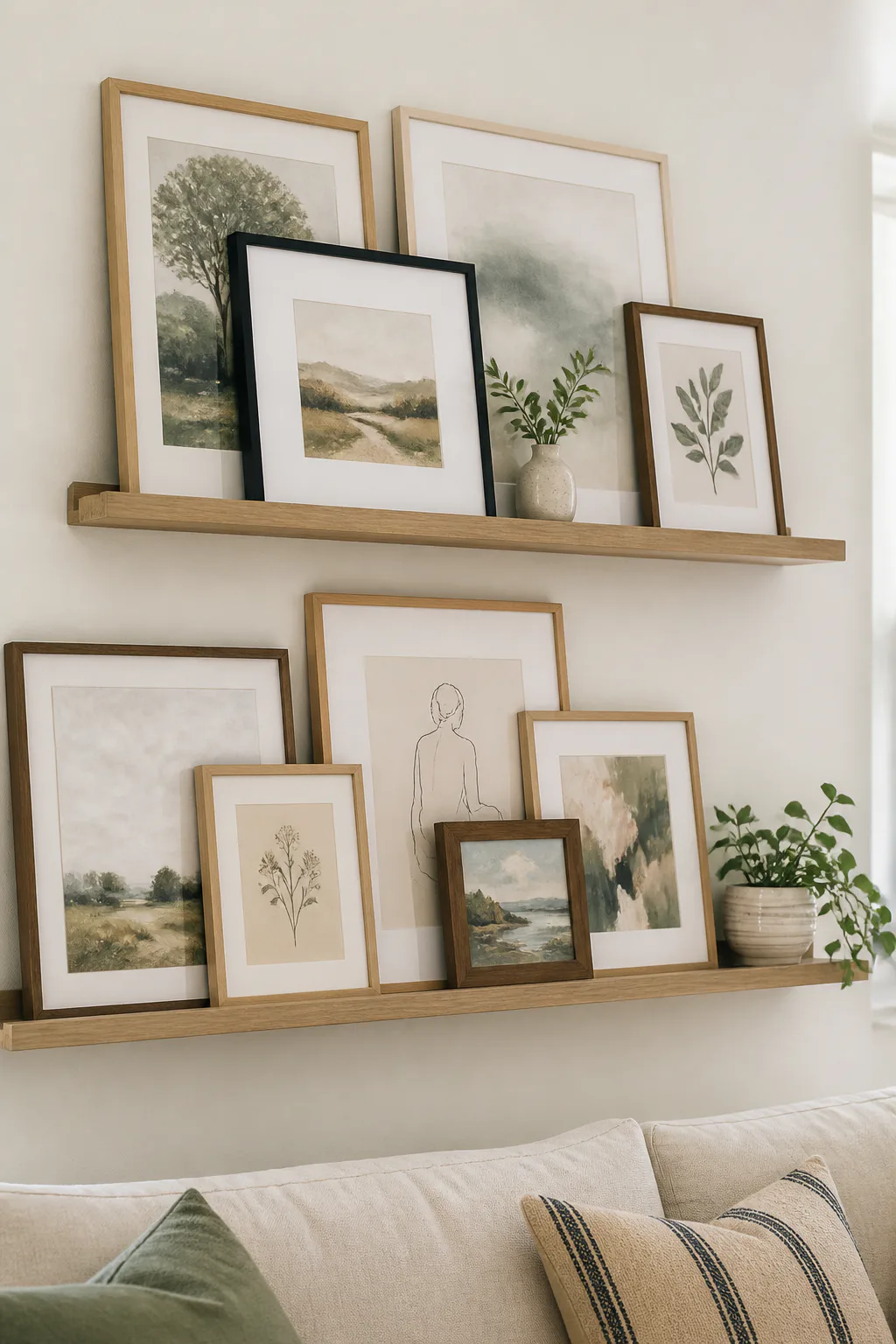
Floating picture ledges let you create a gallery wall that is easy to refresh. Instead of hanging every frame individually, lean artwork along the ledge and overlap pieces slightly. This layered display suits casual living rooms and works particularly well when you like changing prints, adding new finds, or rearranging the room seasonally.
Mixing frame sizes gives the ledges depth, but the composition still benefits from a shared thread. Similar frame finishes, a repeated color, or a consistent subject can connect an eclectic mix. Ledges also work above a sofa or console, where the furniture helps ground the horizontal arrangement.
How to style the ledges
Place larger frames toward the back and smaller pieces in front, checking that important artwork remains visible. Keep the ledge’s weight and installation appropriate for the frames and objects you plan to display.
- Combine tall frames with smaller prints for varied heights.
- Overlap frames lightly rather than hiding most of each image.
- Add a small object only if it complements the art and fits securely.
- Repeat one or two frame finishes to keep the mix cohesive.
Because the display is not fixed in place, it can evolve with your home.
6. Wrap a Gallery Wall Around a Corner
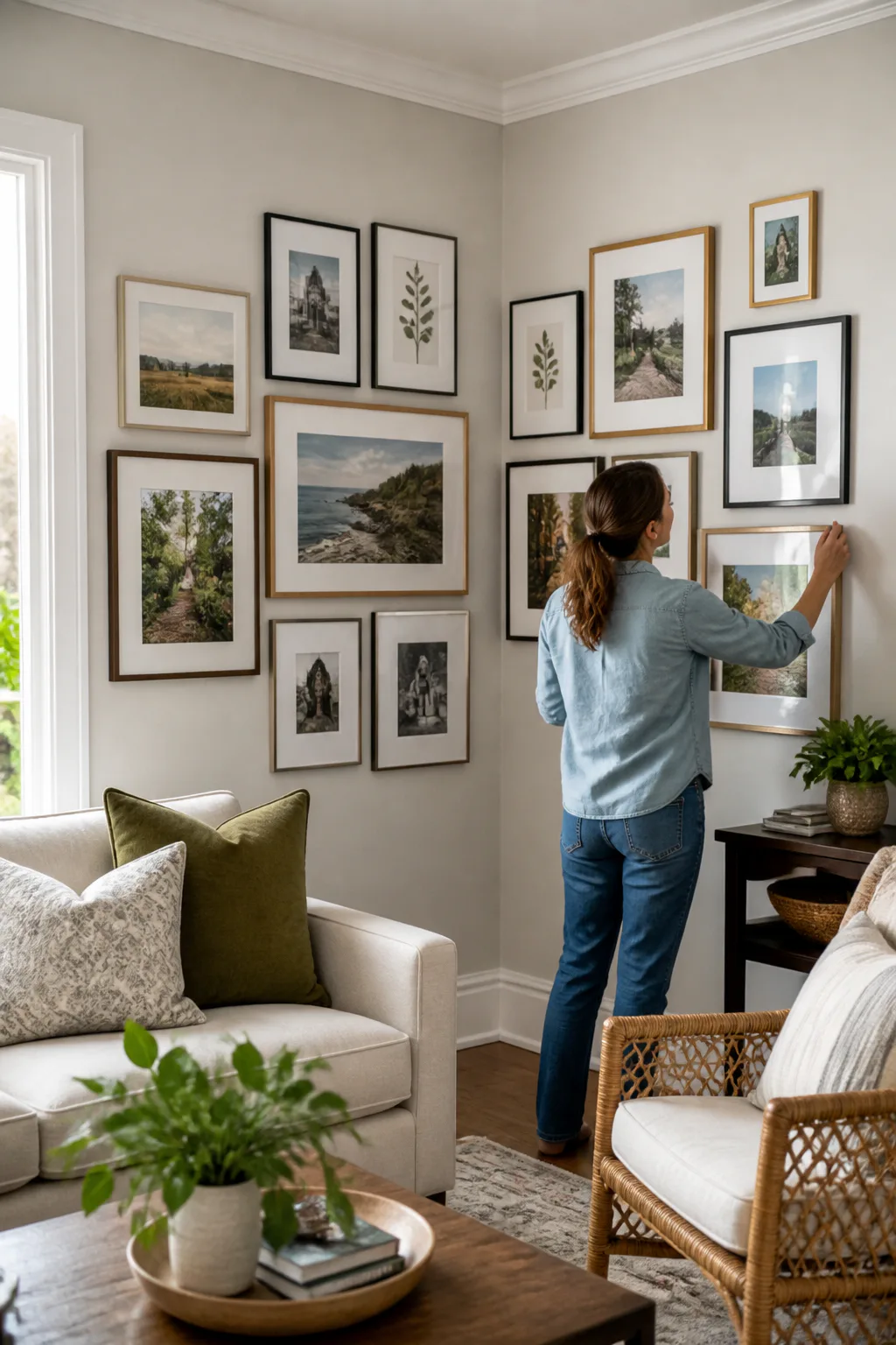
Best for: Making use of a corner
Effort: A weekend project
Continuing a gallery across two adjoining walls turns an overlooked corner into a purposeful feature. It can work especially well in a living room where a sofa, reading chair, or console sits near the meeting point of two walls. A consistent collection makes the corner feel like one connected display rather than two separate arrangements.
Choose a visual link that carries across the corner, such as a shared frame finish, subject, or color palette. The pieces do not need to mirror each other, but the arrangement should feel balanced from both sides of the room. Leave enough space around the corner so frames do not collide with trim or feel squeezed together.
How to connect the two walls
Plan both sides at the same time by sketching their proportions or arranging paper templates on the walls. Step back from several viewpoints to check that the collection reads well as you move through the room.
- Repeat a frame color or artwork theme on both walls.
- Keep spacing consistent as the display turns the corner.
- Choose frame depths that sit comfortably near the wall junction.
- Balance the number and visual weight of pieces on each side.
This approach makes an awkward angle feel integrated into the room’s design.
7. Blend the Television into a Gallery Wall

Best for: Disguising a wall-mounted TV
Effort: A weekend project
A television can feel like a stark rectangle on an otherwise decorative wall. Surrounding it with black-and-white prints helps the screen become part of a broader composition when it is turned off. A loose, organic arrangement feels more natural than a rigid frame around the television and suits rooms where the screen shares space with art.
Keep the television as the visual anchor, then arrange prints around it with enough room for the screen and any nearby equipment. Repeating monochrome imagery can soften the contrast between the dark screen and the wall. Make sure the display does not block controls, vents, or access to cables.
How to compose around the screen
Use paper templates to test the relationship between the television and the surrounding frames. View the layout with the screen both on and off, since its appearance changes the wall’s visual balance.
- Choose black-and-white photos or line drawings for a unified look.
- Vary frame sizes to create a relaxed, surrounding cluster.
- Leave clear access to cables, outlets, and television controls.
- Keep the surrounding art from competing with the screen’s edges.
The gallery gives the entertainment area a more finished, room-like feel.
8. Create a Black-and-White Gallery in Slim Frames
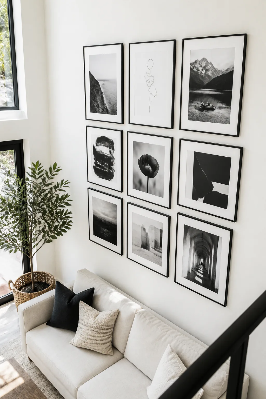
Best for: Graphic, minimalist style
Effort: An afternoon project
Monochrome art paired with slim frames creates a crisp gallery wall that feels calm and coordinated. Black-and-white photography, line drawings, and simple graphic prints can sit together without relying on a wide range of colors. This style works well in a modern living room or in a more colorful space that needs one visually quiet feature.
Matching black frames make the images feel graphic, while slim white frames can blend into a pale wall for a lighter effect. You can choose a grid for a precise display or an asymmetrical cluster for a softer arrangement. A mix of subjects keeps the wall interesting while the limited palette holds it together.
How to keep the display cohesive
Decide on the frame finish before choosing the final arrangement. If the images vary in contrast, use similar mats to give each piece a consistent border and visual weight.
- Combine photography, sketches, and graphic prints in one palette.
- Repeat slim black or white frames throughout the display.
- Use matching mats to make different artwork sizes feel related.
- Choose a grid or loose cluster to suit the room’s overall style.
The restrained palette lets shape, subject, and composition do the work.
9. Pair Antique Gold Frames with Vintage Prints
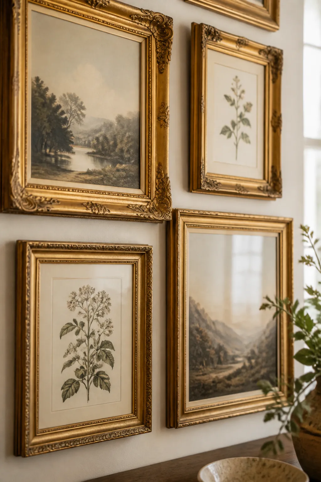
Best for: Traditional or eclectic rooms
Effort: An afternoon project
Antique gold frames bring warmth and a sense of history to a living room gallery wall. Pair ornate or thrifted frames with muted landscapes, botanical sketches, or other vintage-inspired prints for an old-world look. The combination suits rooms with traditional details, but it can also add character to a simpler space.
Frames do not have to match exactly for the collection to feel considered. A shared aged finish helps connect different shapes and sizes, while subdued artwork keeps ornate detailing from becoming too busy. Try the grouping above a console, fireplace, or reading chair where it can feel like a collected display.
How to mix vintage pieces
Arrange the frames before hanging them and pay attention to how their profiles relate. If several frames are elaborate, balance them with quieter prints or simpler frames so the wall has room to breathe.
- Look for a consistent warm or aged gold tone.
- Pair ornate frames with muted landscapes or botanical art.
- Mix frame sizes while keeping the overall grouping balanced.
- Use a few simpler frames to offset more decorative profiles.
The result feels layered and personal rather than overly formal.
10. Mix Pressed Botanicals with Earthy Art
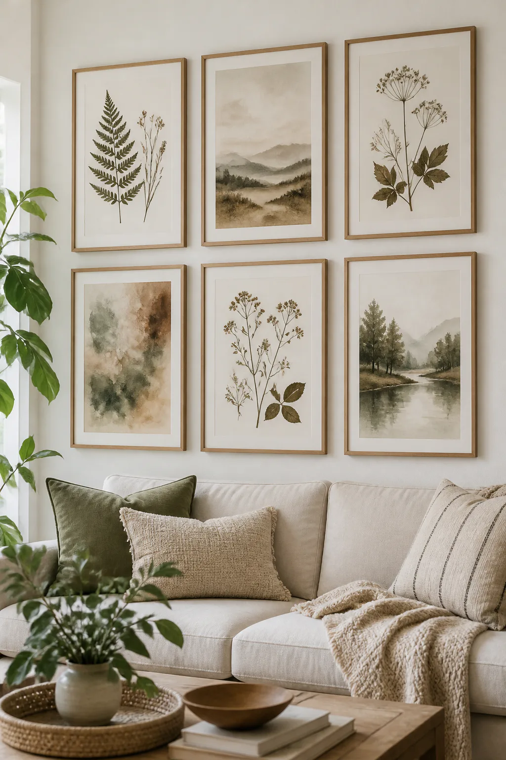
Best for: Natural, earthy decor
Effort: An afternoon project
Pressed leaves and dried florals add natural detail to a gallery wall, while earthy watercolor prints bring in a soft, painterly quality. Together, they create a calm display suited to a living room with natural textures, warm neutrals, or greenery. This mix works in a compact grouping above seating or as part of a larger, loosely arranged collection.
Varying the contents keeps the wall from feeling like a set of identical botanical studies. Delicate leaves behind glass can sit beside landscapes or abstract prints in muted greens, browns, and warm neutrals. Repeating wood, black, or natural-toned frames helps the varied pieces feel connected.
How to make a natural mix
Balance the fine detail of pressed botanicals with simpler artwork so the display does not become visually crowded. Consider how changing daylight reaches the wall and choose a placement that suits the materials.
- Combine framed leaves or dried florals with earthy watercolor prints.
- Repeat a frame finish to unify different botanical subjects.
- Include quieter, open compositions alongside detailed specimens.
- Echo natural colors already present in plants or textiles.
This gallery brings a gentle connection to nature into the room.
11. Make a Gallery Wall of Family Keepsakes

Best for: Personal, story-filled walls
Effort: An afternoon project
A family gallery wall can bring portraits, candid photographs, and meaningful paper keepsakes into everyday view. Mix formal images with relaxed snapshots, then add items such as heirloom invitations or travel postcards to tell a story that feels specific to your household. It works well along a hallway-facing wall or above a family seating area.
Because the images may come from different times and formats, a simple framing approach can help them feel like one collection. Matching frames create order, while a limited palette of frame finishes allows more variety. Leave some visual breathing room so every meaningful piece can be seen.
How to curate a personal collection
Gather the photographs and keepsakes first, then choose a layout that accommodates their different shapes. Use suitable mats or protective framing for delicate paper items, and make sure the arrangement is easy to update as new memories are added.
- Mix portraits with candid photos for a natural family story.
- Include invitations, postcards, or other meaningful paper pieces.
- Use repeated frame finishes to connect varied images.
- Place especially treasured items where they are easy to appreciate.
The wall becomes both decor and a small, evolving record of shared memories.
12. Fill the Wall with Eclectic Art and Mirrors
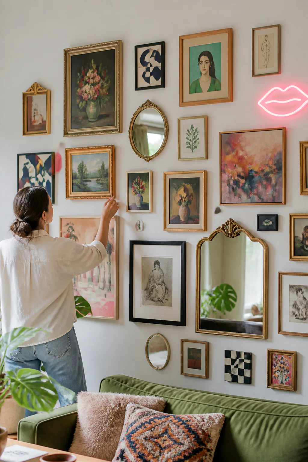
Best for: Bold, maximalist style
Effort: A weekend project
An eclectic gallery wall makes room for different eras, subjects, and textures in one expansive display. Combine artwork with small mirrors, mismatched frames, or a neon sign to create a lively focal point. This idea suits a maximalist living room where the goal is a layered, expressive look rather than a restrained arrangement.
Filling more of the wall can still feel intentional when the composition has a rhythm. Distribute visually bold pieces across the arrangement, and repeat a few colors or shapes to connect otherwise unrelated objects. Mirrors can break up the art and reflect light, while a sign adds a distinct graphic note.
How to make maximalism feel considered
Build the display in stages, starting with the largest or most distinctive pieces. Step back often and adjust the balance of color, shape, and open space instead of adding items wherever a gap appears.
- Mix different art styles with small mirrors and varied frames.
- Spread statement pieces across the wall rather than clustering them.
- Repeat colors or shapes to create subtle visual connections.
- Leave practical clearance around switches, trim, and furniture.
A well-edited mix can feel abundant without becoming a jumble.
13. Center a Woven Textile Among Framed Prints
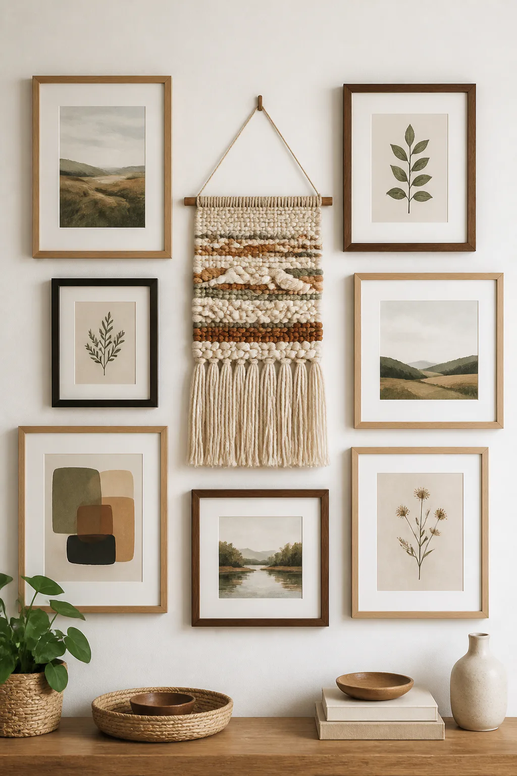
Best for: Adding texture and softness
Effort: An afternoon project
A woven wall piece adds softness and texture to a gallery made mostly of flat artwork. Place a macramé piece, woven fiber art, or vintage textile near the center, then arrange framed prints around it. This contrast suits cozy living rooms where wood, woven baskets, or tactile upholstery already play a role.
The textile can act as a focal point without needing to be the largest object. Its texture naturally draws attention, so keep the surrounding art supportive rather than equally busy. A few frames in related colors can connect the textile to the rest of the room and keep the grouping from feeling disconnected.
How to combine texture and art
Arrange the flat artwork around the textile while considering how far each piece projects from the wall. Use suitable hanging hardware for the textile and give it enough space to remain distinct among the frames.
- Center a woven piece among framed prints or drawings.
- Echo the textile’s colors in nearby artwork or frames.
- Balance textured surfaces with simpler, quieter images.
- Check that the textile hangs securely and has room to sit naturally.
The mix gives a gallery wall a more tactile, handmade character.
14. Frame a Gallery with Wall Sconces

Best for: Evening ambience
Effort: An installation project
A pair of wall sconces can make a central gallery grouping feel framed and intentional. Place one on either side of the art to add symmetry and a warm glow to the living room, especially in a seating area used in the evening. Battery-operated sconces offer an option when wiring is not part of the plan.
The lighting should support the artwork rather than compete with it. Choose simple forms if the frames are ornate, or a more decorative sconce when the art itself is quiet. Check that the sconces have enough clearance from nearby frames and that their light creates a comfortable effect in the room.
How to integrate the lighting
Plan the positions of the sconces and artwork together so the full arrangement feels balanced. If you are using battery-operated fixtures, follow their installation guidance and consider how easily you can access them for maintenance.
- Place sconces on either side of a central art grouping.
- Keep the lighting style in step with the frames and room decor.
- Leave enough space so fixtures do not crowd the artwork.
- Check the light from the main seating position before finalizing.
The added glow helps the gallery remain a feature after daylight fades.
15. Mix Shadow Boxes with Framed Artwork
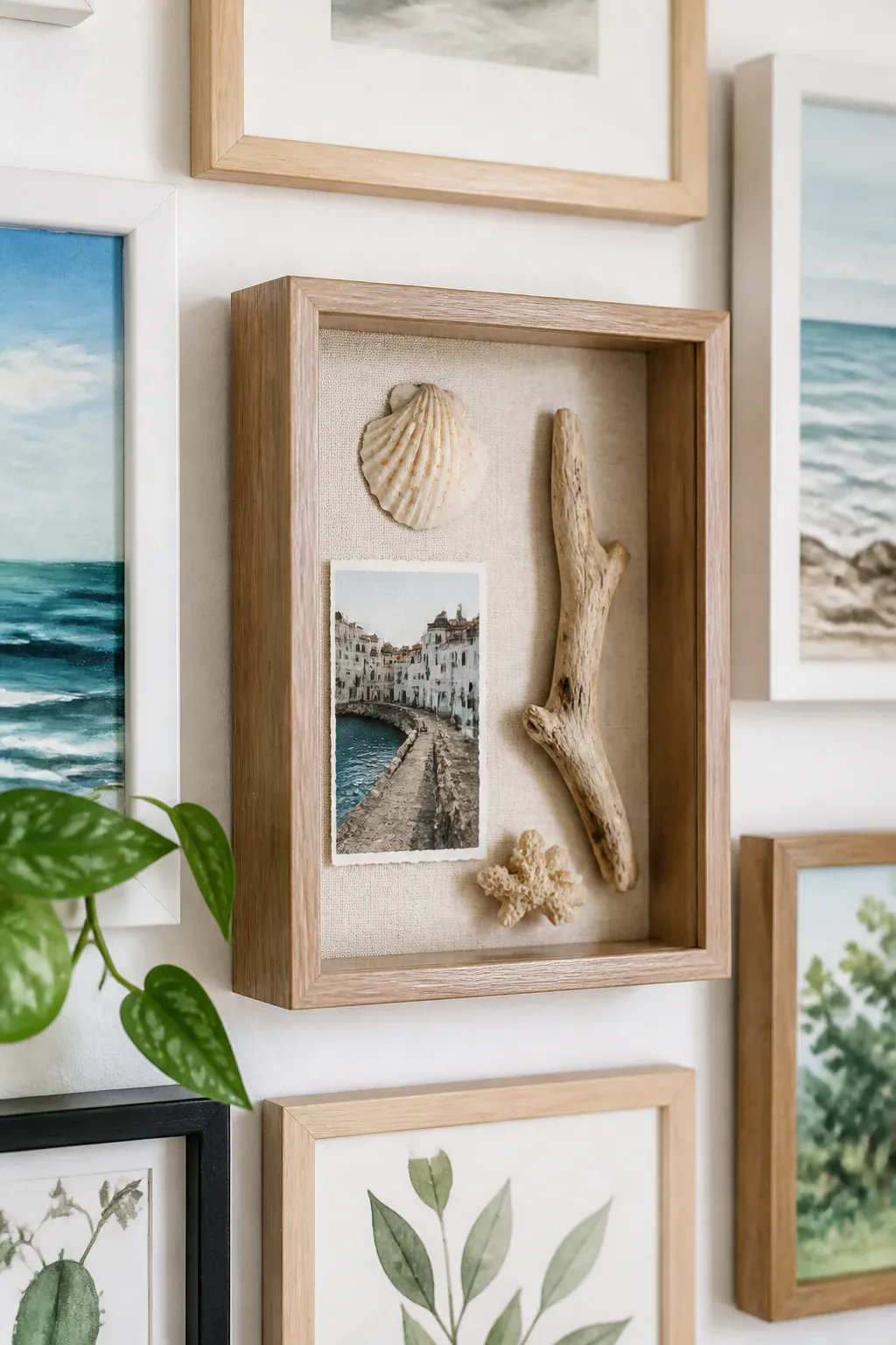
Best for: Displaying 3D keepsakes
Effort: An afternoon project
Shadow boxes bring three-dimensional objects into a gallery wall of flat artwork. Use them to display travel keepsakes, small curios, or another lightweight object with personal meaning. The added depth breaks up a run of rectangular frames and makes the collection feel more like a display of stories than a set of prints.
Because objects draw attention, a few carefully chosen shadow boxes are usually easier to integrate than many competing pieces. Place them among frames with related colors or subjects, and check that their depth works with the surrounding arrangement. A small trailing plant can also add a living element if it is suitable for the location.
How to add dimension
Lay out the shadow boxes alongside the frames before hanging anything. Consider the weight, mounting requirements, and visibility of each object so the display remains both secure and easy to enjoy.
- Choose small objects with a clear personal or visual connection.
- Space shadow boxes between flat frames rather than clustering them.
- Repeat a frame finish or color to tie the mixed media together.
- Check mounting and weight requirements for each box.
A little depth gives the gallery a tactile, collected quality.
16. Break Up Frames with a Round Brass Mirror
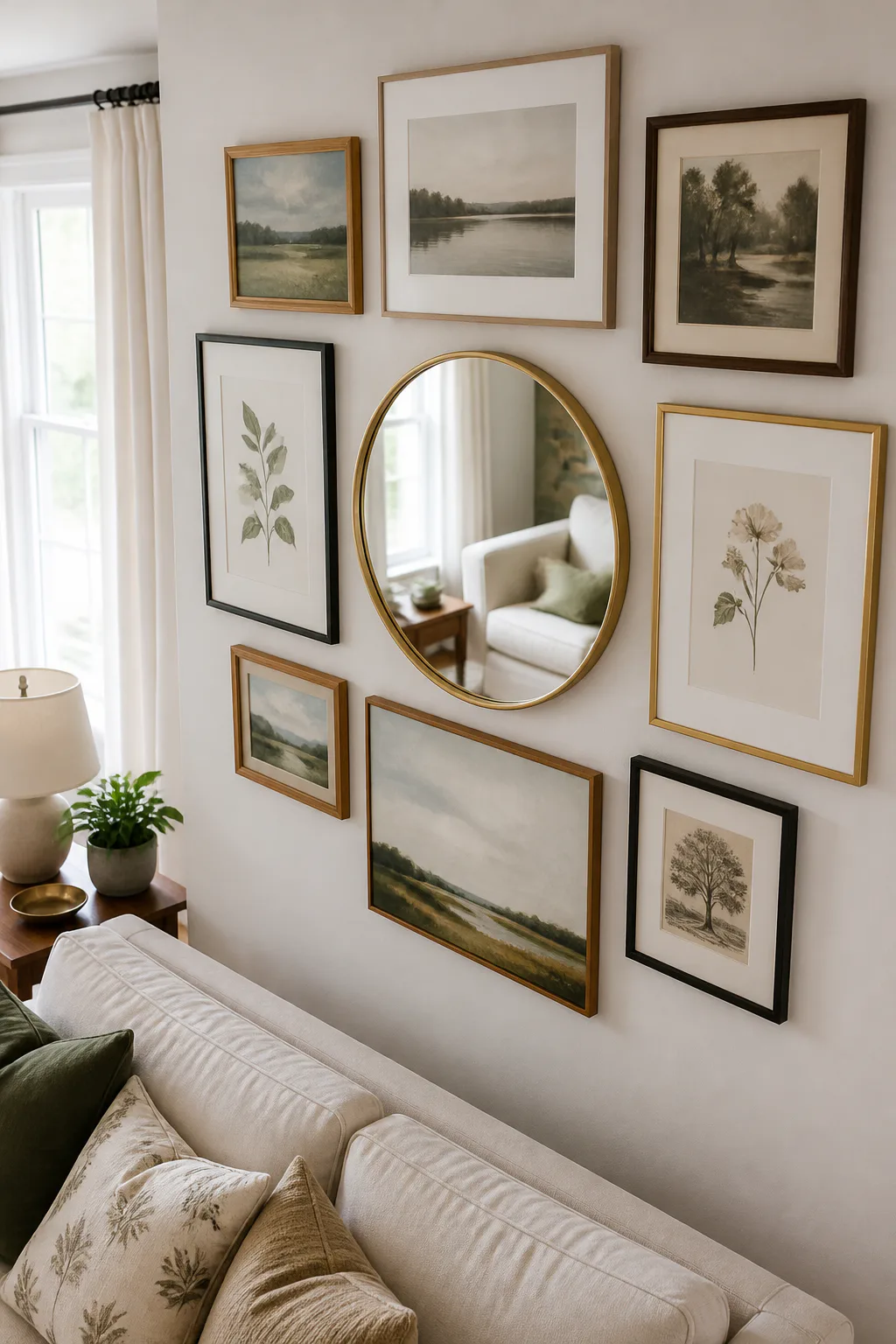
Best for: Breaking up a busy arrangement
Effort: An afternoon project
A round or irregular-shaped brass mirror creates a welcome contrast among rectangular frames. Its curved outline softens a gallery wall made up of straight edges, while the reflective surface adds another layer of light and depth. This idea works as a central accent or as a smaller feature tucked among prints in a broader arrangement.
Brass brings warmth, but the mirror does not need to match every other metal in the room exactly. Let its shape and finish provide a point of difference, then connect it to the gallery through nearby colors or a complementary frame tone. Check what the mirror reflects so it adds to the view rather than emphasizing clutter.
How to place the mirror
Try the mirror in a few positions within the arrangement before hanging it. Its shape can help balance a cluster of square or rectangular art, so view the entire wall from the main seating area as you make adjustments.
- Use a round or irregular mirror to interrupt straight frame lines.
- Choose a brass finish that sits comfortably with the room’s palette.
- Check the reflection from common viewpoints around the living room.
- Balance the mirror with art of similar visual weight nearby.
The contrast makes the overall display feel more dimensional and relaxed.
Frequently Asked Questions
How high should a gallery wall be above a sofa?
Leave about 8 to 10 inches between the sofa back and the lowest frame, and keep the center of the arrangement near eye level.
How do I plan a gallery wall without extra holes?
Trace each frame on paper, tape the templates to the wall and adjust until the layout feels balanced before hammering any nails.
Should all gallery wall frames match?
Matching frames look clean and modern; mixed frames feel collected. Repeat one color or finish to tie a mixed gallery together.
What is the most renter-friendly gallery wall?
Floating picture ledges need only a few screws and let you swap art without new holes, and adhesive strips work for light frames.
Final Thoughts
A living room gallery wall can be tidy and symmetrical, loosely layered, or full of meaningful objects and varied textures. Start with the layout that fits your wall and furniture, then use repeating colors, frame finishes, or subjects to bring the collection together.
Before hanging the pieces, try your arrangement on the floor or with paper templates on the wall. Adjust the spacing, step back to view it from the sofa, and let the display grow at a pace that feels right for your home. The most inviting gallery walls are the ones that reflect the people who live with them.